From Hidden Pathways to Discoverable Support: Improving the Help & Support Experience of the UN Digital Library Through Eye-Tracking
💻 Client
United Nations Digital Library
👥 Team
Roshni Ganesh
Elizabeth Serjantov
Vasilios Nikolopoulos
⏰ Timeline
Feb’26 - May’26 (3 Months)
⚒️ Tools
Tobii Pro Lab, Zoom
Figma
Google Suite
👩🏽💻 My Role
Research Study Design
Participant Recruitment,
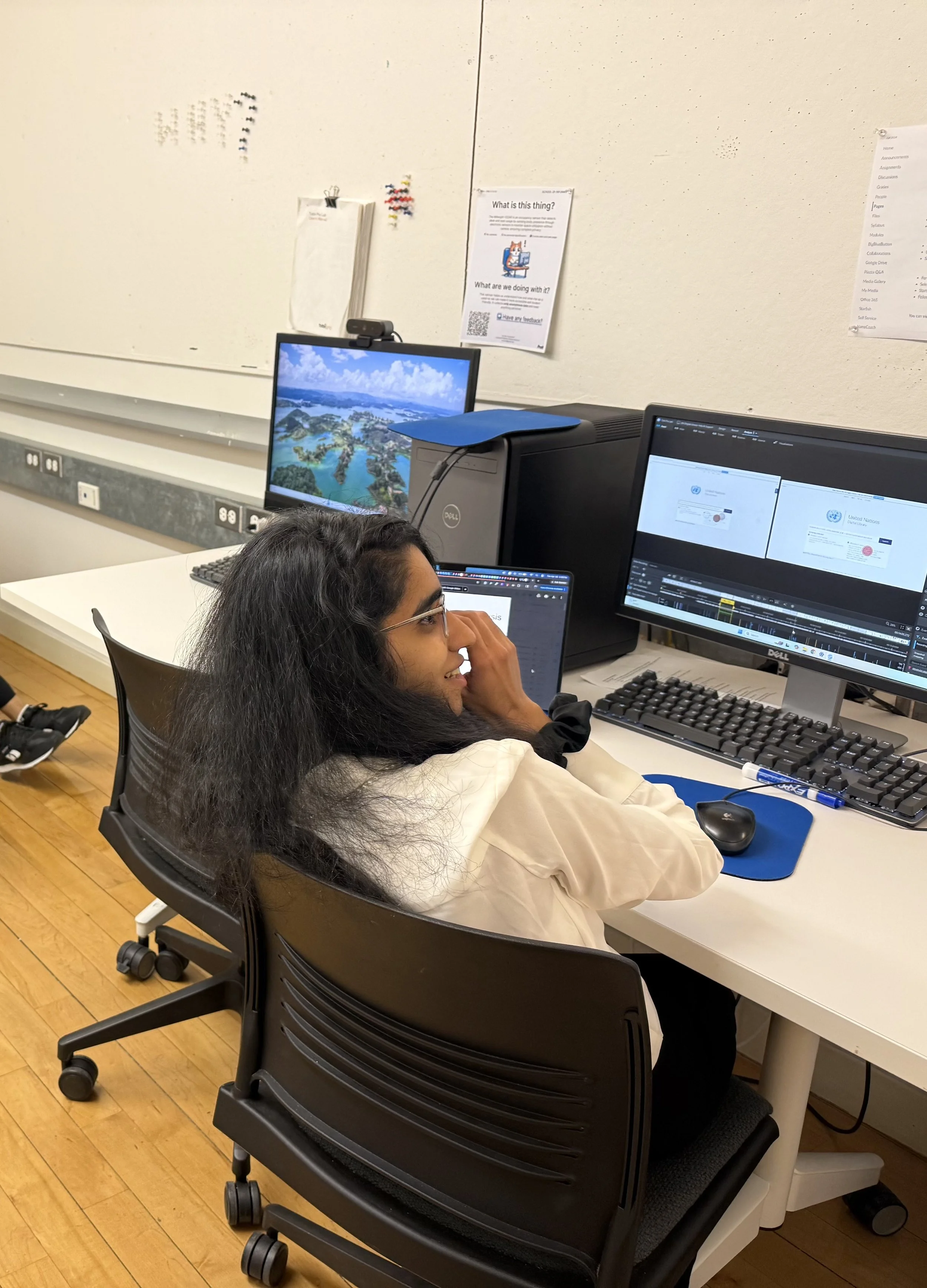
Usability Testing with Eye Tracking
Data Analysis,
UI/UX Design
Setting the context
Background
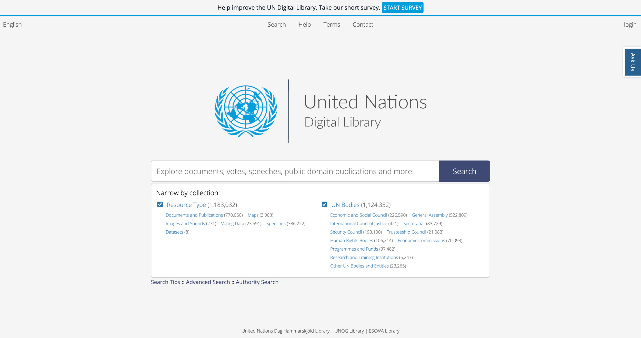
The UN Digital Library (UNDL) serves as a publicly accessible repository for United Nations documents and knowledge resources. Designed for a global audience, the platform supports researchers, students, policymakers, and the broader public in accessing UN-related information.
However, navigating digital library systems can be challenging, especially for first-time or unfamiliar users seeking support during moments of uncertainty.
Through an eye-tracking usability evaluation, our team investigated how users navigated the UNDL platform’s Help & Support systems and where friction emerged during their help-seeking journey.
What did we study?
Research Questions
RQ 1: What do users expect when seeking help on the UN Digital Library?
RQ 2: How visible and understandable are the Help pathways? (Chat, Search Tips, Contact, and Help)
RQ 3: What information matters most to users when they seek help?
What was our process?
-
Captured real-time visual attention patterns across the defined eye-tracking scenarios and tasks to understand what users noticed, overlooked, and struggled to discover during moments of uncertainty.
Our study design
Eye-Tracking
Scenario
Participants were asked to imagine they worked for an NGO and needed to locate the “Universal Declaration of Human Rights” using the UN Digital Library for the first time.
The scenario intentionally introduced unfamiliarity, uncertainty, and realistic information-seeking pressure.
Rather than evaluating isolated interface elements, we framed the study around a progressive support-seeking journey.
-
Helped uncover users’ thought processes, expectations, frustrations, and decision-making after task completion.
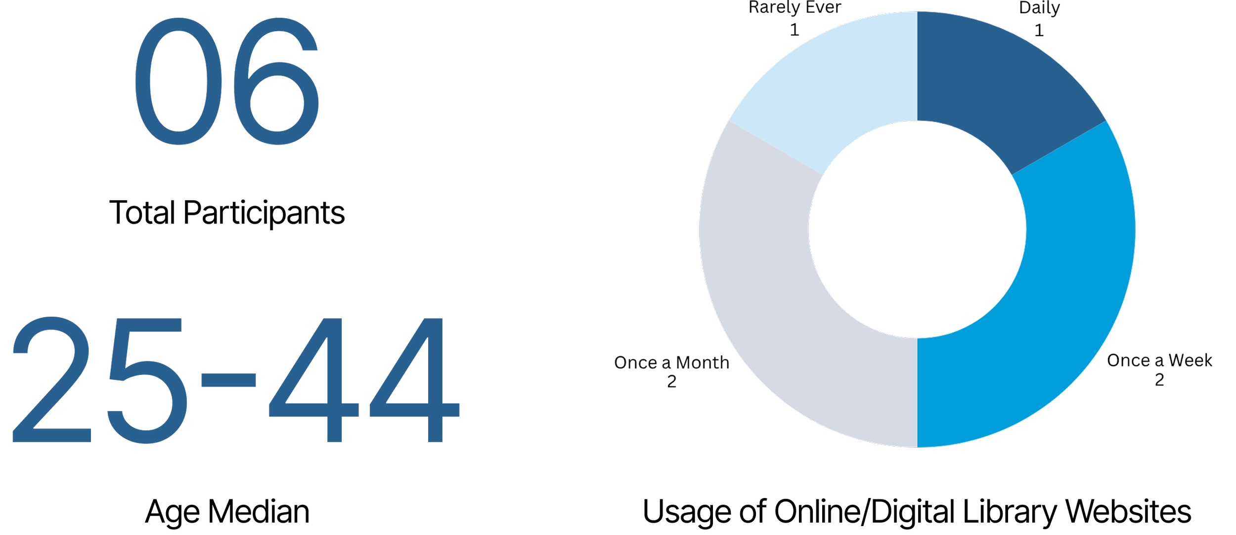
Recruiting participants across varying usage and familiarity levels allowed us to observe how support expectations differed between novice and semi-expert users.
Research Methods
-
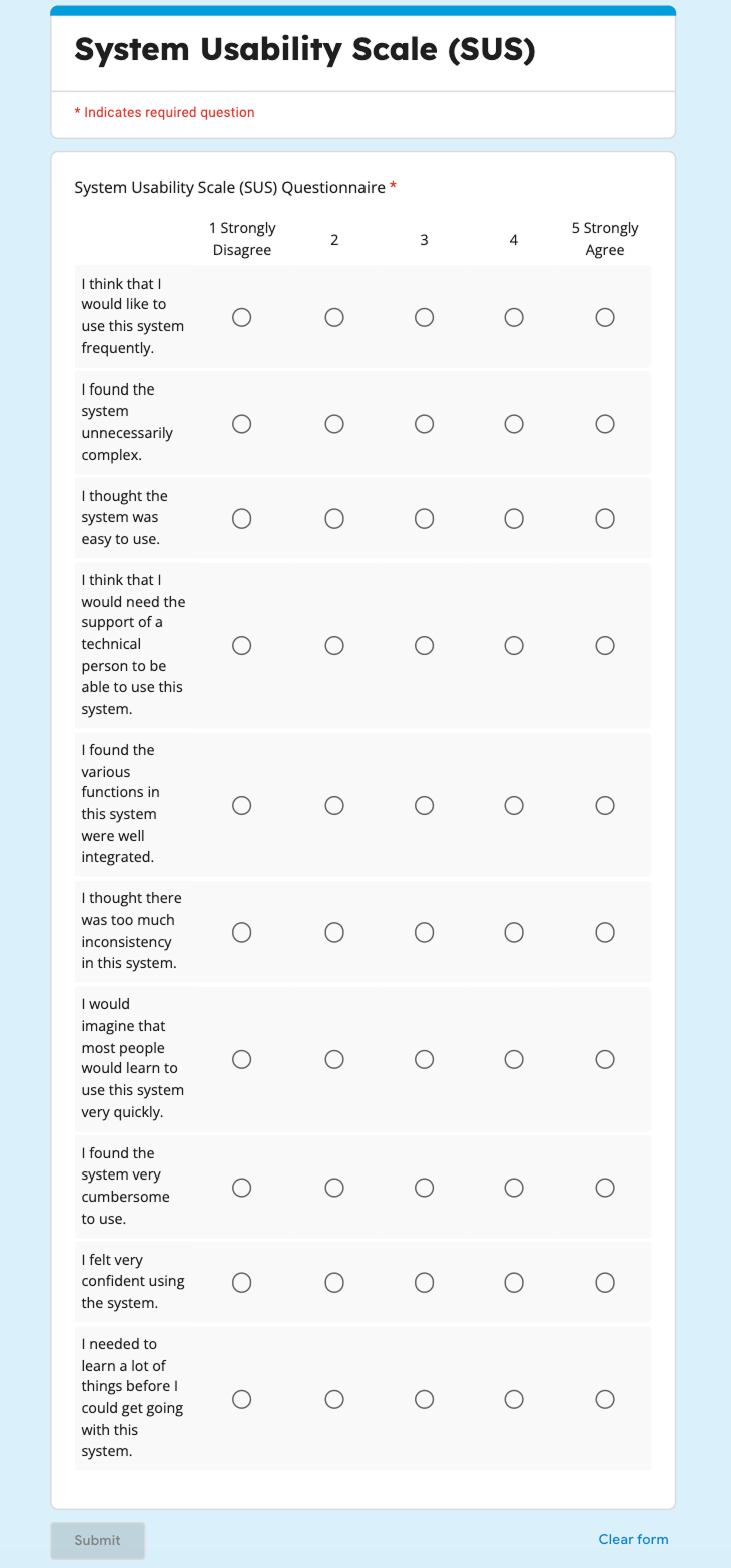
Evaluated the overall usability and learnability of the Help & Support experience through a post-test questionnaire consisting of 10 questions measured on a 5-point Likert scale.

Mapping the Help-Seeking Journey through Tasks
Making sense of all the data
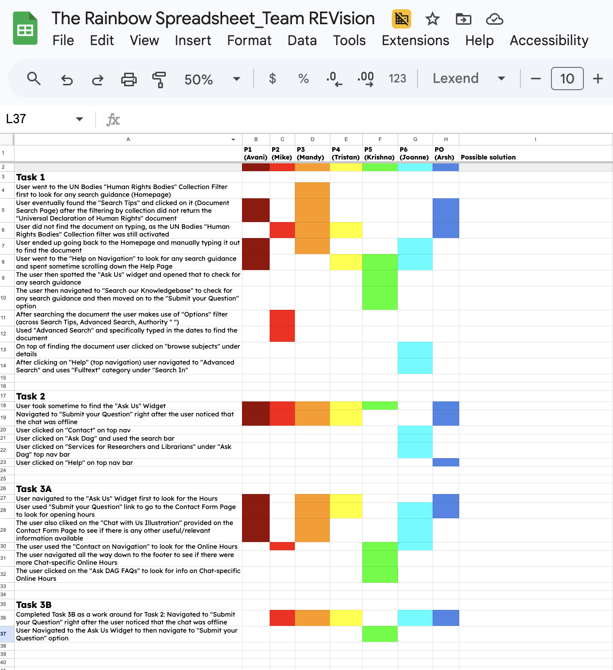
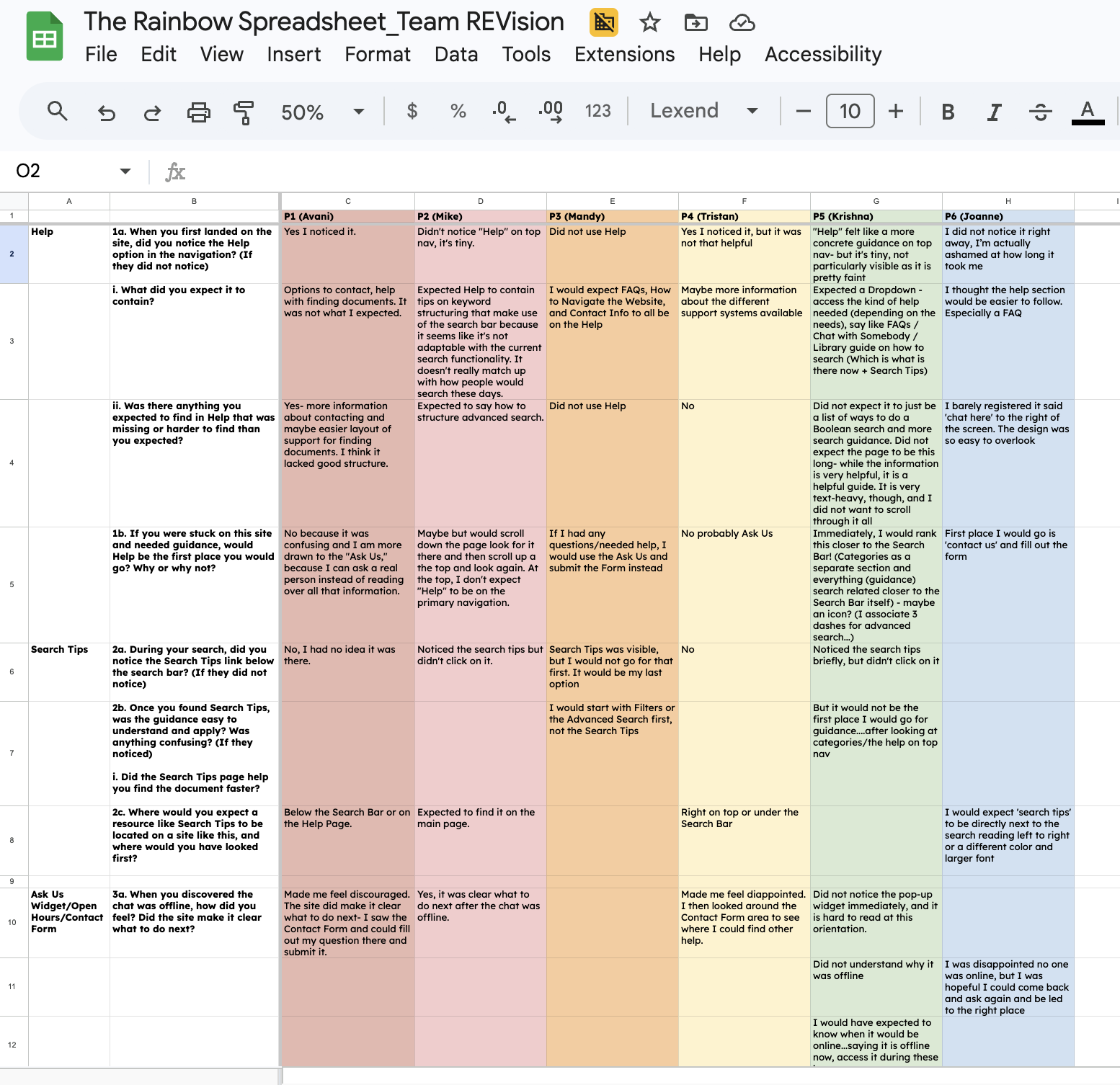
To synthesize our research data, we used the “Rainbow Sheet”: a structured spreadsheet where each researcher recorded behavioral patterns observed during tasks alongside what participants verbalized during the Retrospective Think-Aloud (RTA) session.
Mapping these two data streams together allowed us to identify convergence across all 6 participants, surfacing 3 areas where the system performed well and 3 critical findings where it fell short.
We then consolidated all six SUS questionnaire responses to calculate the final system usability score, giving us a quantitative anchor for the qualitative patterns we had already identified.
Synthesis
What did we find?
The Results
What worked?
-
Users consistently navigated to “Help” in the main navigation, trusting it as the most reliable source for relevant information.
-
When chat was unavailable, users quickly identified the contact form as a fallback. The form was perceived as standardized, familiar, and easy to complete.
“It was very easy to find the contact form page once the chat was unavailable”
-
Users appreciated the depth of guidance provided through Help and Search Tips, supporting independent problem-solving.
“The information on help is very helpful... I am sure it is a helpful guide, but...”
System Usability Score: 39.6
0-50 — Not Acceptable
What needs to be improved?
One of the strongest findings from the study was that support systems can technically exist within an interface while remaining behaviorally invisible to users.
Participants frequently overlooked support mechanisms despite those elements being physically visible on screen.
Improving discoverability and information architecture can make the support experience more effective and reassuring.
50-70 — Marginal
70-100 — Acceptable
We notice that the overall Help & Support experience scored significantly below usability benchmarks.
Industry Benchmark: 68
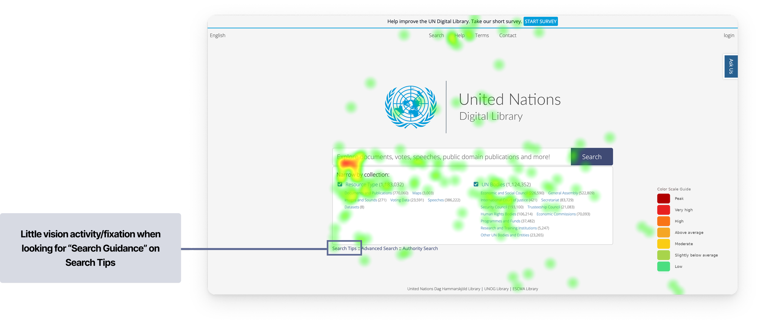
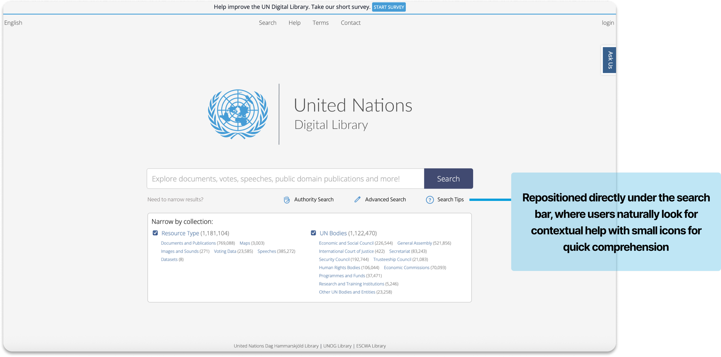
0/6 participants found the Search Tips on the first go for the intended task and expected it to be somewhere closer to the “Search Bar”
0/6 Participants did not understand how Search Tips was different from Advanced Search and how it could help them
“For help finding documents, I would start with Filters or the Advanced Search first, not the Search Tips”
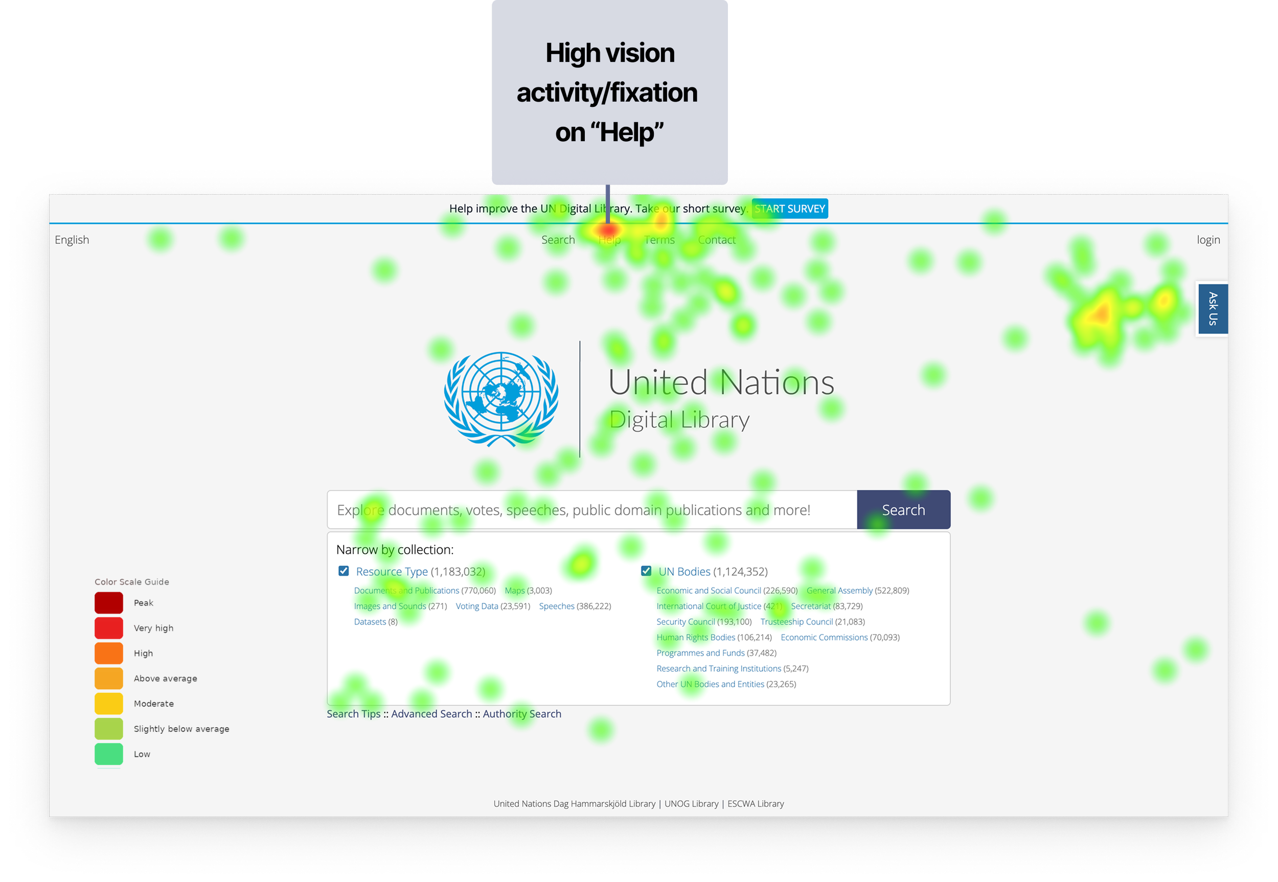
Combined heatmap showing gaze distribution across all 6 participants during Task 1
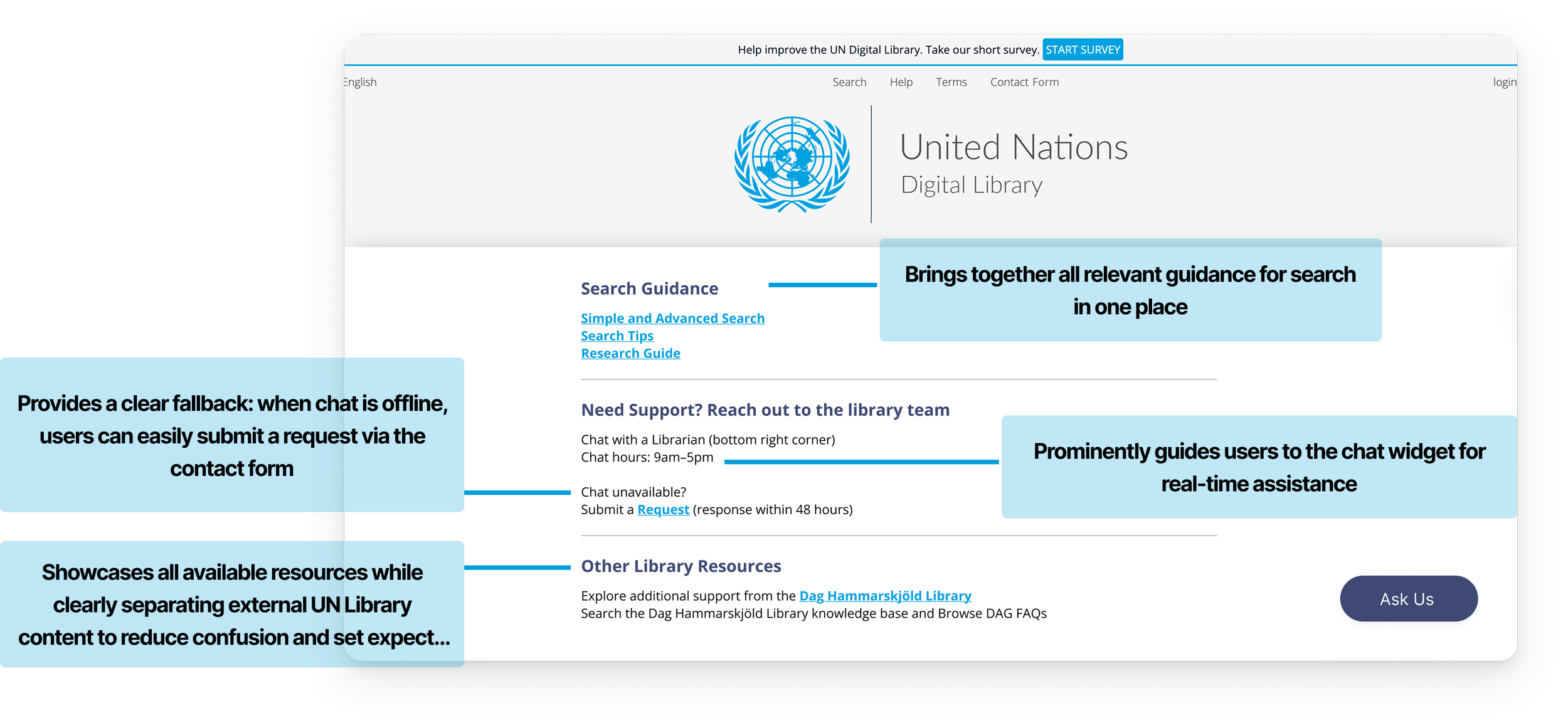
Transformed search guidance from a passive resource into an integrated part of the search experience.
Recommendation 1
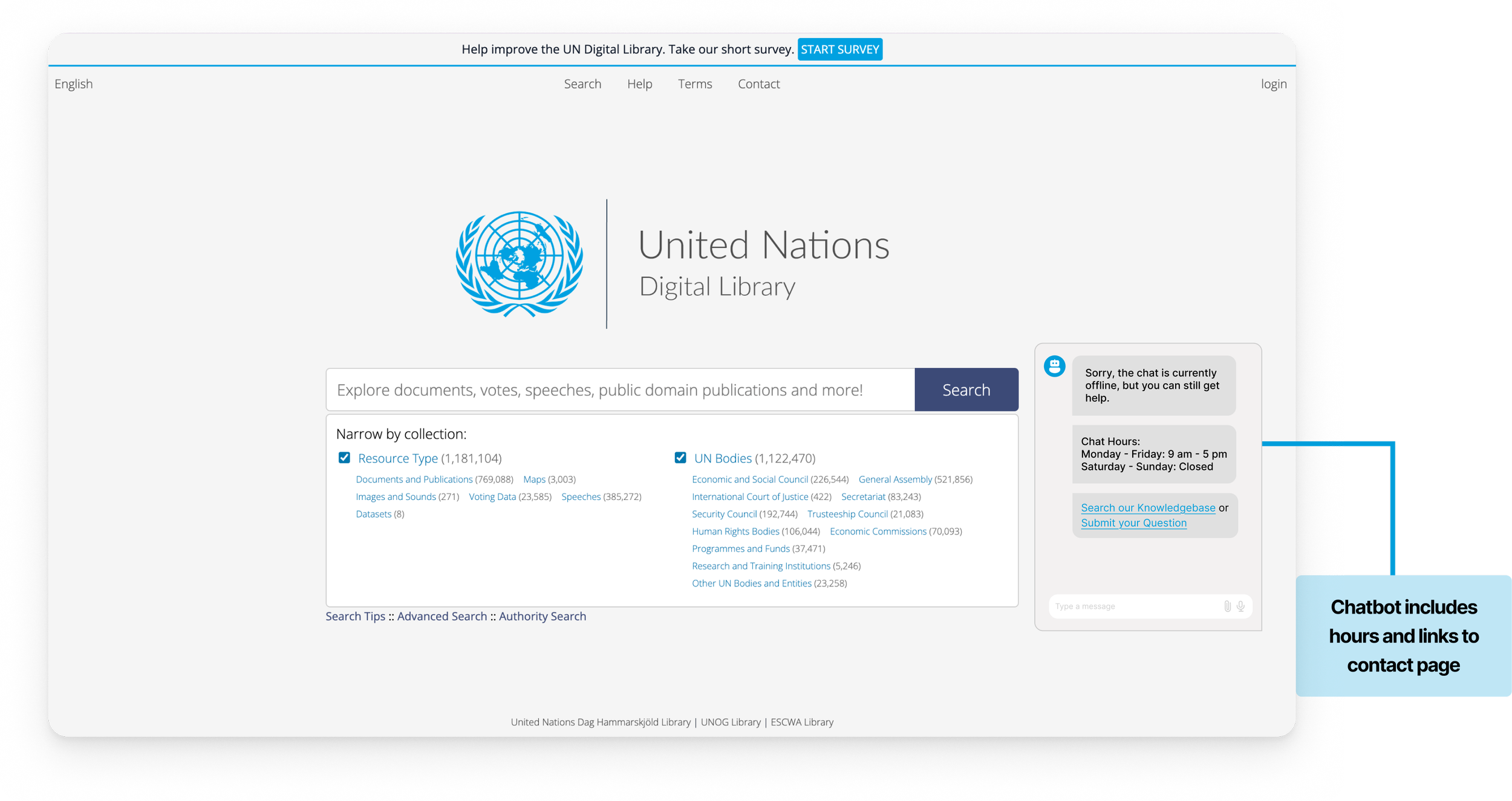
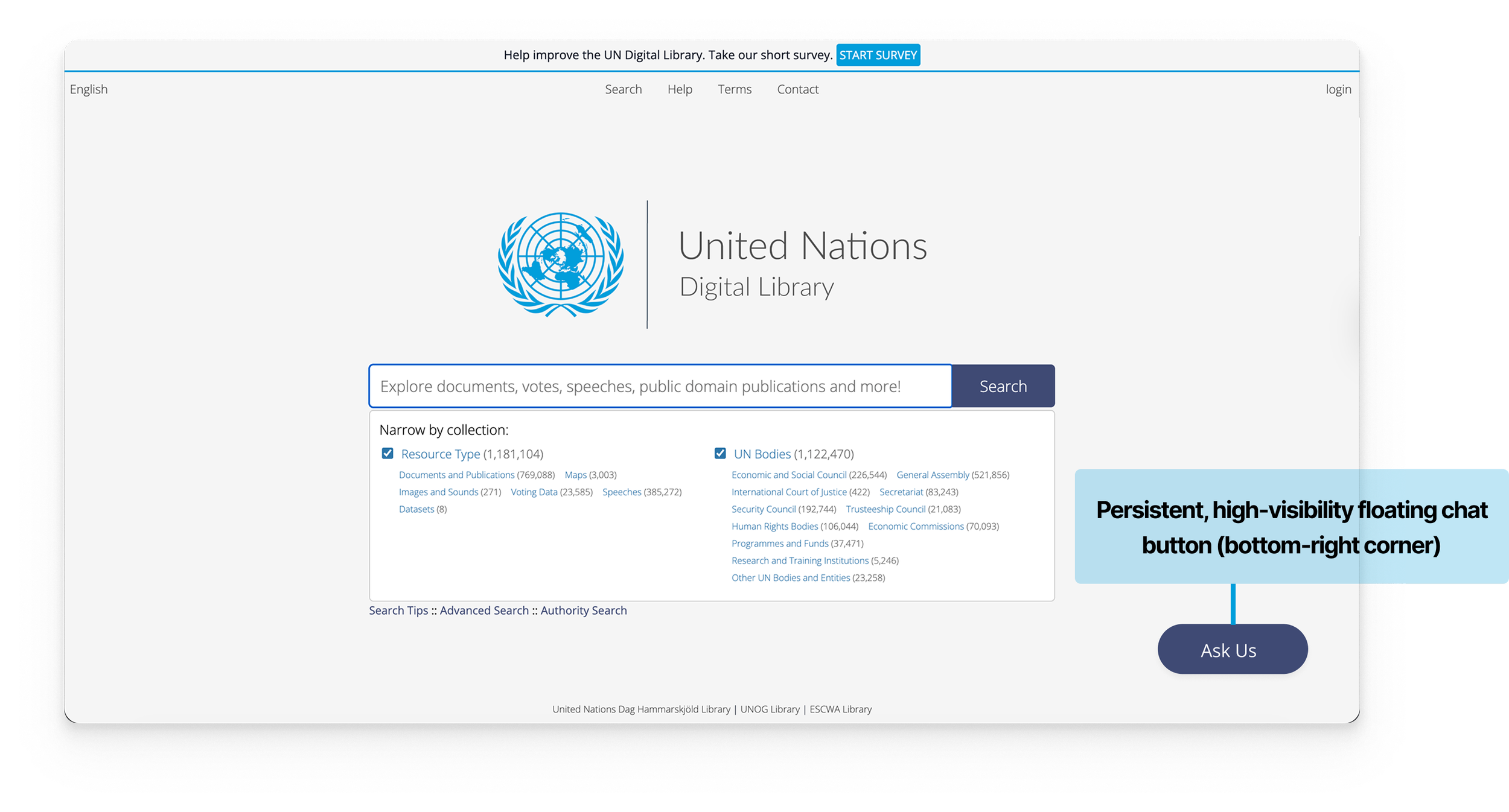
Finding 2: The “Ask Us” widget was not immediately discoverable, requiring users to actively search for it rather than naturally noticing it.
Scan path analysis showing approximately 10 seconds elapsed before any visual attention landed on the "Ask Us" widget during Task 2
Finding 1: The Search Tips is very hard to locate and mostly invisible to users
“I would expect ‘search tips’ to be directly next to the search reading left to right or a different color and larger font...”
“Did not notice the pop-up widget immediately, and it is hard to read in this vertical orientation.”
“Did not understand why chat was offline...and I expected the hours to be on the chat.”
The average time to find the “Ask Us” Widget was ~30 Seconds among 5/6 participants, with
1 participant taking >1 Min and
1 not noticing the Widget at all.
Additional Finding
Clicking the 'Ask Us' widget revealed no chat hours.
The only hours participants could find were on the Contact page, but those reflected the Library's general schedule, not the chat service, leaving users genuinely unsure when live help was available.
Participant 1 spent over 2 minutes attempting to find the chatbot's operating hours
We proposed a more visible and persistent bottom-right chat experience, a universally recognized placement for desktop support widgets with integrated availability information and clearer fallback pathways to reduce ambiguity and create a more reassuring support experience during moments of friction.
Recommendation 2
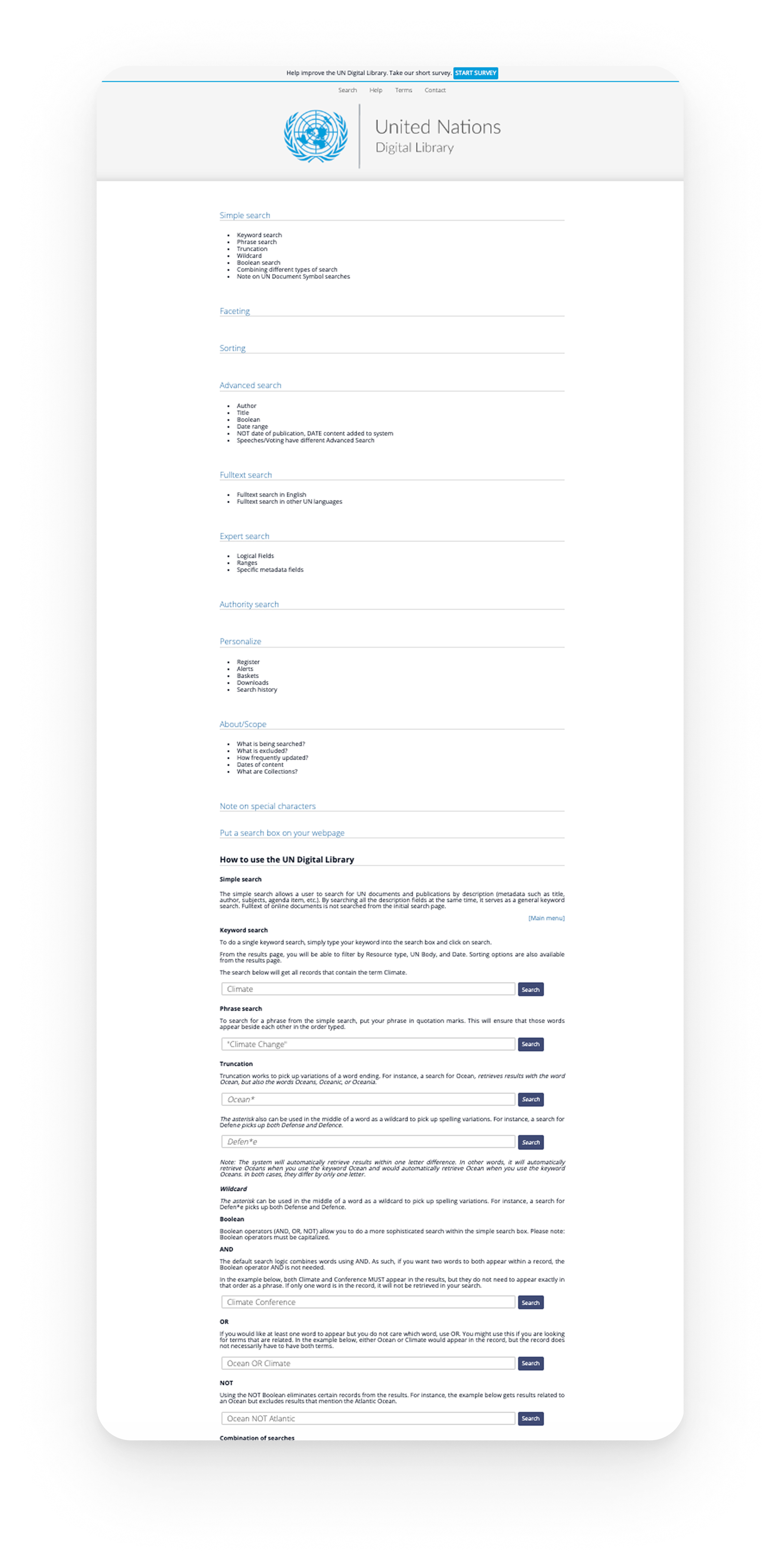
Finding 3: Users’ Mental Model of what information “Help” on Top Nav should contain did not match the existing information present
“Options to contact and help with finding documents. It was not what I expected.”
The redesigned Help experience focused on improving discoverability, reducing confusion, and creating a more intuitive support ecosystem for users seeking guidance.
“I would expect FAQs, How to Navigate the Website, and Contact Info to all be on the Help Page.”
“Yes, I noticed help, but it was not that helpful...”
“Did not expect it to just be a list of ways to do a Boolean search and more search guidance and also did not expect the page to be this long”
Recommendation 3
Key Learnings and Next Steps…
Our findings and recommendations were delivered to the UN Digital Library team through a final presentation supported by eye-tracking evidence, usability insights, and redesigned support concepts. The client responded positively to the behavioral insights and discoverability challenges uncovered during the study, and particularly appreciated the proposed recommendations for improving the Help & Support experience.
Some of the strongest insights emerged when eye-tracking data confirmed what participants expressed verbally, and at times, revealed friction that users themselves were unable to articulate.
The next steps would involve A/B testing the proposed redesigns, validating improvements through iterative usability testing, and measuring the impact through usability and engagement metrics.
Conclusion
“Quote”