

Enhancing the Zines Research Guide at Pratt Institute Libraries
Leveraging moderated usability testing to surface key user insights and drive meaningful usability improvements for a zines research guide serving 5,000+ users.
⏰ Timeline
April’25 - May’25 (4 Weeks)
👥 Team
Roshni Ganesh
Krishna Kishore Lal
Mengqi Cao
👩🏽💻 My Role
Research, Participant Recruitment, Usability Testing, Data Analysis, UX Design, Usability Testing Research Report
📚 Client - Pratt Institute Libraries
Pratt Institute Libraries serves a diverse academic community of 5,000+ students, faculty, staff, and alumni.


🔎 Context
The library’s zine collection has been growing with over 875+ zines, but there have been challenges in navigating the virtual browsing of these physical zines via the library website.
This study focuses on evaluating the organization and effectiveness of the Zines Research Guide.
🎯 Research Goals
What were the client’s key focus areas for this study?
🧠 Understand User Needs and Perceptions
Uncover how users navigate, interpret, and experience the guide to identify key pain points and expectations.
💻 Evaluate and Improve the Guide’s Browsing Experience
Assess the effectiveness of current features and enhance the overall virtual browsing experience, particularly within the Browse Random section.
🚀 Identify Areas for Future Development
Surface actionable insights and long-term opportunities to inform ongoing improvements and feature enhancements.
Moderated Usability Testing
How did we go about it?

👥 Recruited Participants
Created a Screener Survey on Panelfox and distributed it via the School of Information listserv and School of Design faculty to recruit participants with both library-focused and design-oriented perspectives on zines.
They had to be:
👩🎓 Pratt Institute students (Majoring in Graduate Library Science, Undergraduate Communications Design or Pratt Foundations)
📚 Somewhat to very familiar with zines
📰 Having prior engagement with zines in any format
Our Final Interviewee Demographics:
👩🎓 4 Graduate Students from the MS Library and Information Science program
👩🎓 1 Undergraduate Student from the BFA Communication Design program
👨🎓 1 Undergraduate Student from the Pratt Foundations program
👩💻 Conducted Interviews

6 participants
I led 2 Interviews :)

Virtual Zoom Sessions

45-60 Min Sessions
📝 Pre-and Post-test Questionnaire
Sessions began with a brief warm-up to understand participants’ familiarity with zines and digital library use
Participants then completed 5 tasks
Each session concluded with post-test reflections on the overall experience, confusion points, and suggestions for improvement
📝 The 5 Tasks
Homepage Exploration – First impressions, clarity, and navigability
Browse Random – Discoverability, scroll behavior, and usefulness
Browse by Subject – Finding zines by theme; assessing category clarity
Zine Detail Page – Evaluating layout, metadata comprehension, and visual hierarchy
Add to Bag – Testing interaction feedback and user expectations
📊 Collected and Analysed Data
1
Collected qualitative & quantitative data through:
→ Interview recordings
→ Think-aloud protocols
→ Pre- & post-task questionnaires
→ Probing questions during sessions
2
Conducted a task-by-task analysis to identify specific usability issues
3
Synthesized findings into recurring problems, grouped by frequency
💡Key Findings & Recommendations
What issues did we find, and what do we recommend doing?
Note: The guides were built using LibGuides Platform (Springshare) and the platform’s limitations were considered throughout the study.
Themes that emerged
-
Dense text and lack of context made information hard to interpret
-
Overlapping topics and unclear terms caused confusion
-
Key features like Browse Random were hard to find
-
Fragmented structure disrupted browsing flow
-
No clear feedback on user actions; elements felt broken or confusing
Key Finding 1
Content gaps and visual design hindered the completion of user tasks
❌ What did not work for the Users?
On the Homepage:
Physical vs Digital Zines: All users missed the small text explaining that the search bar is for physical zines, leading to confusion.
New Zines Section: Users liked the visuals but wanted uniform image sizes and brief descriptions.
Few Resources & Unclear Text: Only two links were provided, and some text felt too library-staff focused.
On the Subject Pages: Users found inconsistent summaries and image sizes. All missed the button to browse more zines in the catalog.


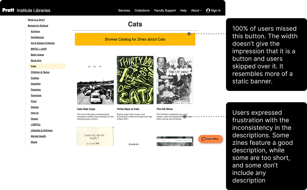
Recommendation 1: Improve the homepage and subject pages through content and visual design changes
✅ What We Improved
On the Homepage:
Clarified Physical vs Digital Zines: Revised copy to clearly mention printed zines, moved key info above the search bar, and included links to digital zines.
Visual Consistency (New Zines Section): Standardized cover image sizes and description lengths; added slideshow indicators for better navigation.
Better Learning Resources Layout: Switched to a grid view to show more resources, enlarged text for visibility, simplified wording, and added helpful links.
On the Subject Pages:
Visual Consistency in Subject Pages: Unified image sizes and descriptions across subject pages.
Improved Button Design: Redesigned to be smaller and clearly interactive.


Key Finding 2
Inconsistent and unreliable Search Experience

❌ What did not work for the Users?
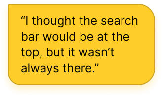
Inconsistent Search Bar Placement: 3 of 6 users expected the search bar on all pages, but it only appeared on select ones.
Hidden Filters: All users missed the “Modify Search” tool for advanced filtering.
Unclear Search Results: Users were unsure if keywords (e.g., “activism”) were official subject tags or just mentioned in descriptions, causing confusion about zine relevance.


Recommendation 2: Improving Search Visibility and Precision
✅ What We Improved
Consistent Search Bar: Added the search bar to all pages of the Zines Guide to reduce confusion and support continuous discovery.
Visible Advanced Search: Renamed and repositioned the “Modify Search” button to make advanced filters easier to find and use.
Search Filters Added: Introduced a dropdown menu for filtering by title, author, or subject, giving users more control and clarity over their results.


Key Finding 3
Fragmented and Confusing Browse Random Experience
A part I helped shape with my recommendation!
❌ What did not work for the Users?
Hard to Spot on the Homepage: 3 of 6 users missed the “Browse Random” section due to its low placement, only noticing it after a prompt, and expressed a strong liking once they discovered it.
Disorienting Scroll: Auto-scrolling felt jarring to 50% of users, making it hard to control or revisit zines.
Unreliable Navigation: 4 of 6 users found the arrow buttons buggy or unpredictable, reducing trust in the feature.
Fragmented Layout: Half of the users described the layout as choppy and hard to follow, disrupting the browsing flow.


Recommendation 3: Enhancing Visibility and Making the Browse Random Navigation Experience Cohesive
✅ What We Improved
Boosted Visibility: Moved the Browse Random section higher on the homepage and relabeled it as “Discover More Zines”, placing it near the search bar to encourage exploration.
Optional Placement Update: Also recommended placing it in the left navigation panel under “What is a Zine?” for quicker discovery during sidebar browsing.
Layout Redesign: Replaced the segmented layout with a consistent grid format (4 slides x 5 columns), reducing cognitive load and improving visual flow.
Manual Navigation Controls: Disabled auto-scroll by default and added manual arrows + indicator dots for better control and orientation.
Introduced an optional “Play” button for users who prefer animated browsing, supporting both structured and exploratory interactions.


🏁 Conclusion
What’s next? What did I learn? What did the clients have to say?
Key Learnings and more…
Client Collaboration: Learned to translate a client brief into focused insights and actionable design recommendations within a tight 4-week timeline.
Participant Recruitment: Learned that recruiting users takes time. Tools like Panelfox and strategic outreach were essential.
Moving beyond Platform Constraints: Springshare’s limitations shaped our design scope. Next time, we’d explore more flexible solutions to allow for bolder UI changes.
Want to dive deep?
View our full report for a detailed look at the process, usability findings, and all findings and recommendations.
Check out an unmoderated usability testing report my team conducted on Goodreads using Userlytics. It highlights user behaviour patterns, key friction points, and actionable insights from a remote testing setup.
“Lovely work! Some expected and some very unexpected and interesting findings! We’re excited to explore how we can implement your recommendations.
Also, great job on recognising the limitations of the LibGuides platform and tailoring your suggestions accordingly.”