

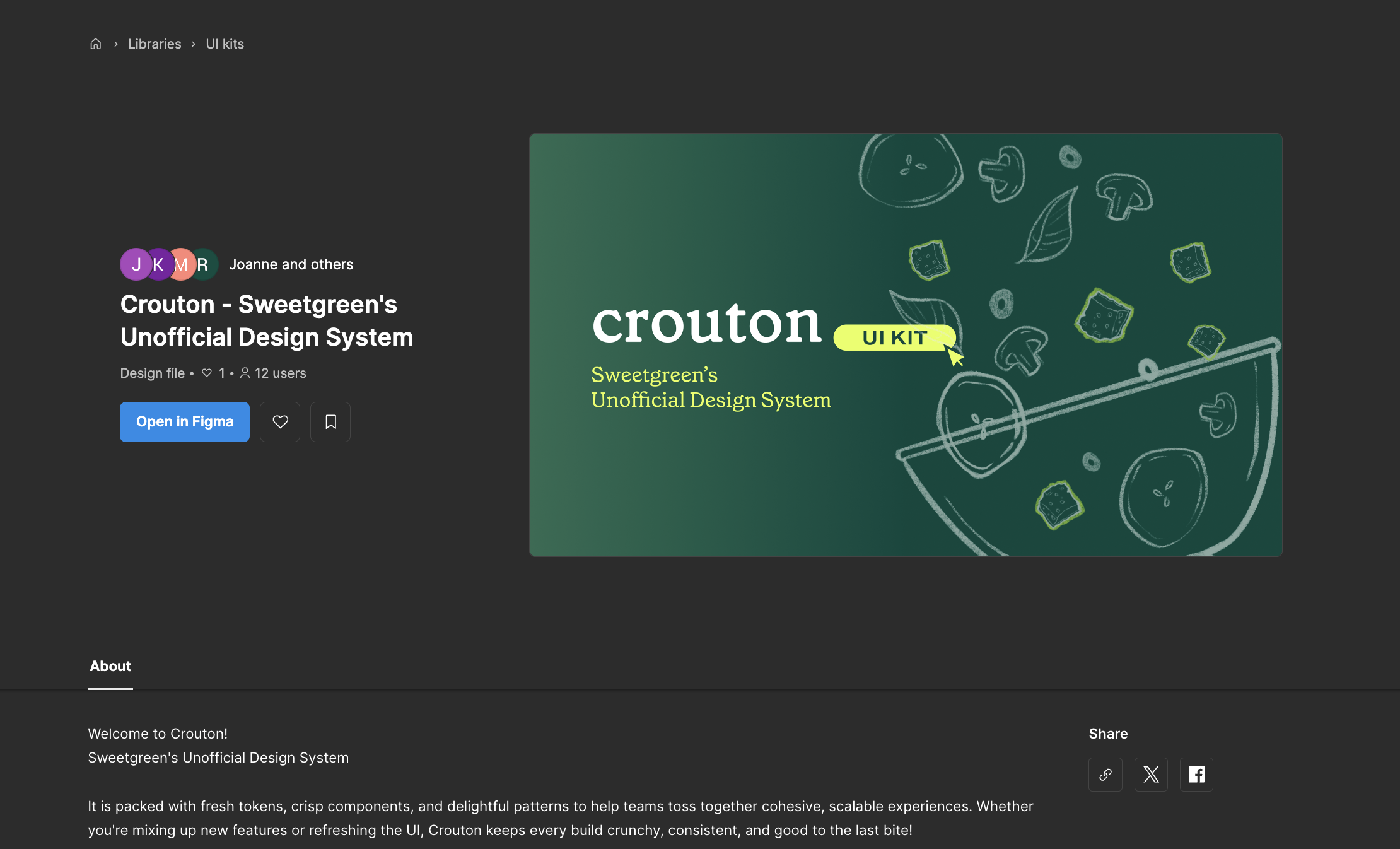
Building the Crouton Design System
A Shared Recipe for Sweetgreen’s Digital Experiences
⏰ Timeline
Sept’25 - Dec’25 (3 Months)
👥 Team
Roshni Ganesh
Keertana Gunnam
May Kim
Joanne Li
👩🏽💻 My Role
UX Designer (Design Systems)
Team Manager
🥬 Lettuce begin
🥗 A Mixed Bowl: The Problem
Inconsistent UI Styles and Accessibility Issues
Too many component variations and inconsistent accessibility standards leading to an incohesive experience.
Founded in 2007, Sweetgreen is a fast-casual brand built around fresh, seasonal, and sustainably sourced food, with a mission to connect people to real food and healthier communities.
As Sweetgreen’s digital ecosystem grew, its interfaces didn’t always grow together.
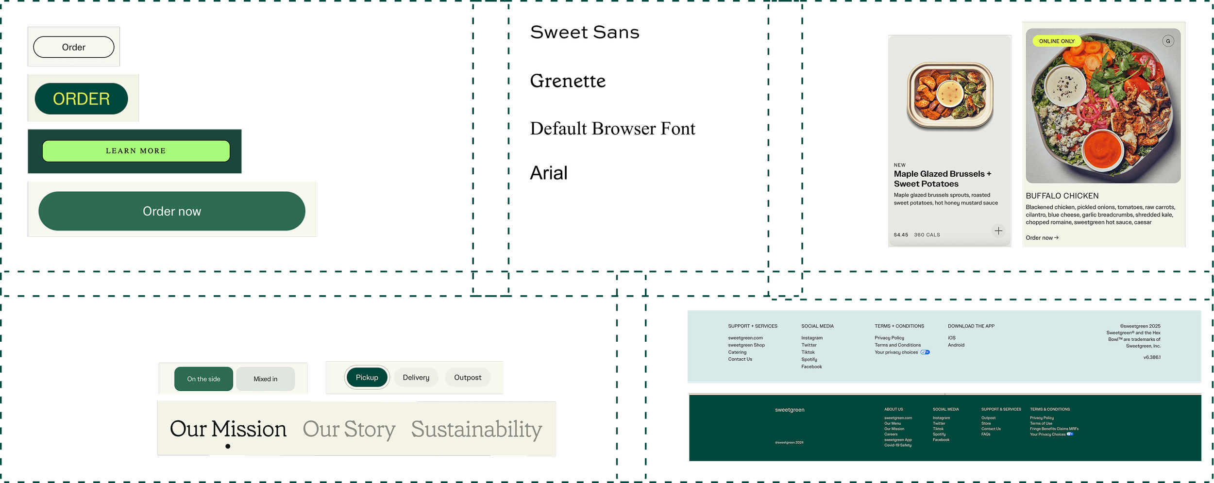
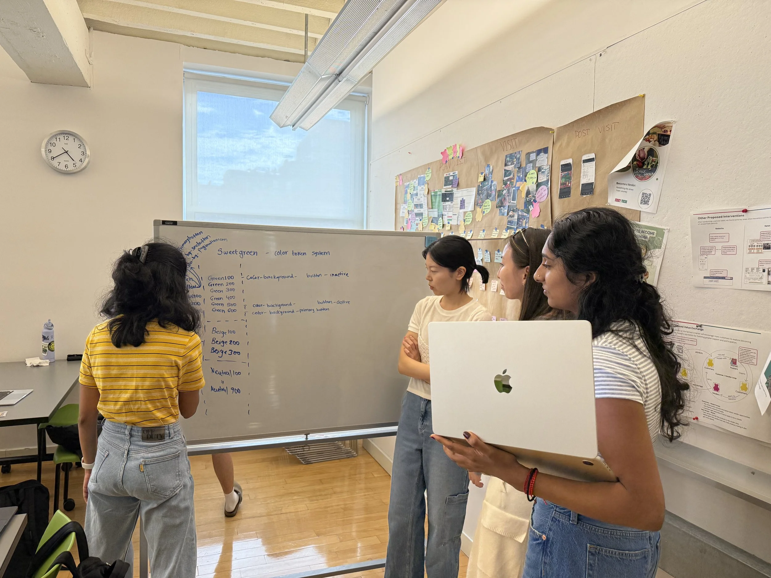
A thorough interface audit of all the pages and every component revealed redundant components, inconsistent colors and typography, accessibility gaps, and patterns that were recreated instead of reused. The result was a fragmented experience and unnecessary friction.
You can view our detailed UI Inventory Audit here

Navigation Challenges
Disconnected navigation creates friction, making the site feel unintuitive.
So, we asked
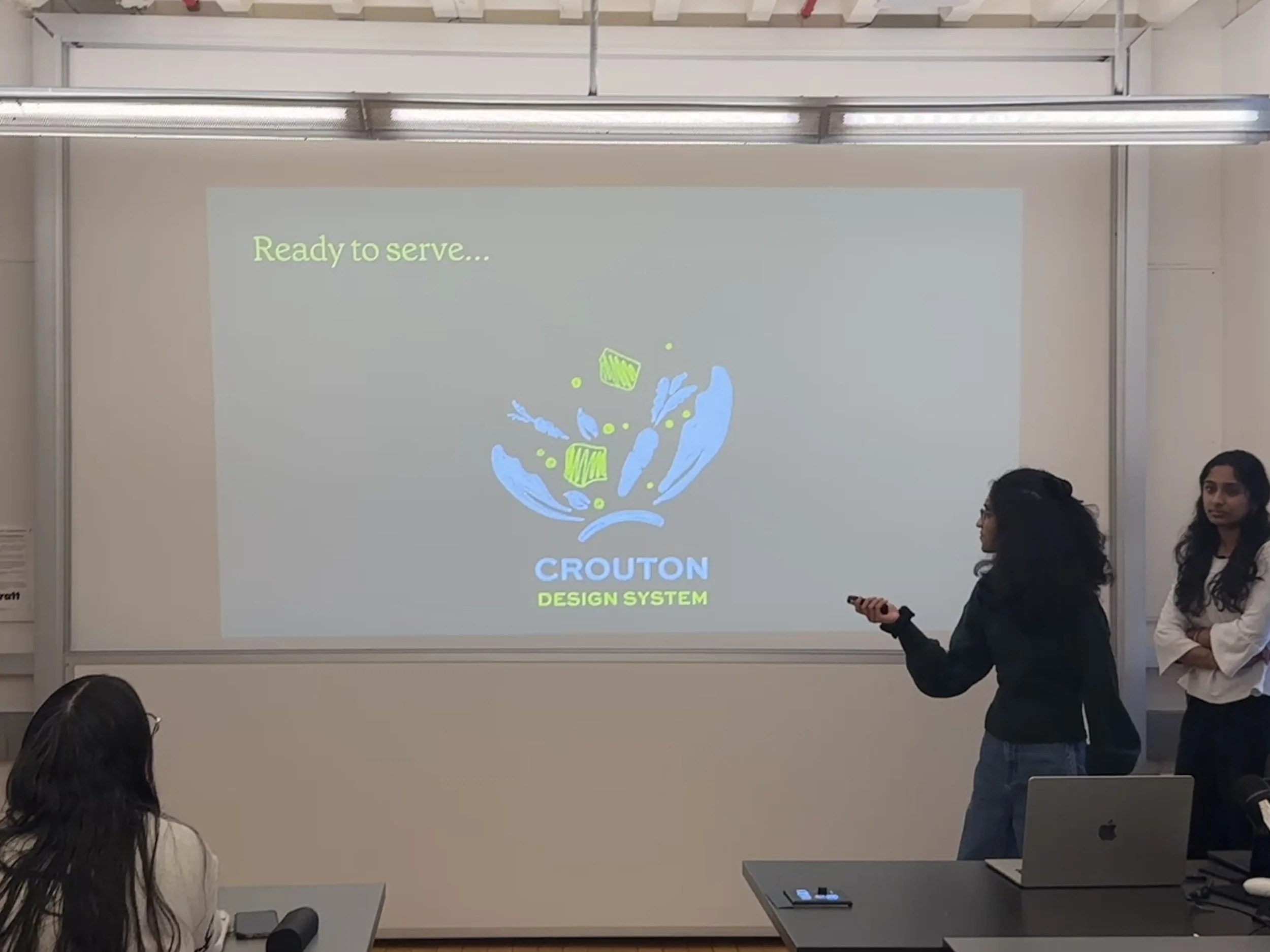
🥖 Crouton Design System: Our Big Idea
🌿 The Recipe: Guiding Principles
Keep it Fresh & Simple
Clean, seamless, and focused on what matters.
🥬 Chopping the Veggies: Style Guide
Scaling Barriers
As the brand’s digital presence expands, maintaining a cohesive experience becomes increasingly challenging.

How might we create a shared foundation that makes Sweetgreen’s experiences cohesive, accessible, and unmistakably Sweetgreen?
Think of Crouton like the crunch in a salad- it brings everything together.
Crouton, Sweetgreen’s unofficial design system, is the shared language for cohesive, accessible, and unmistakably Sweetgreen experiences.
Crouton is shaped by three core principles:
Design for Everyone
Accessible and usable by all.
We started by building a strong foundation. We standardized:
Color palette – Defined primary greens, secondary neutrals, and accent colors to ensure consistency across all screens and components.
Typography – Established a clear type scale and hierarchy, optimized for readability and accessibility.
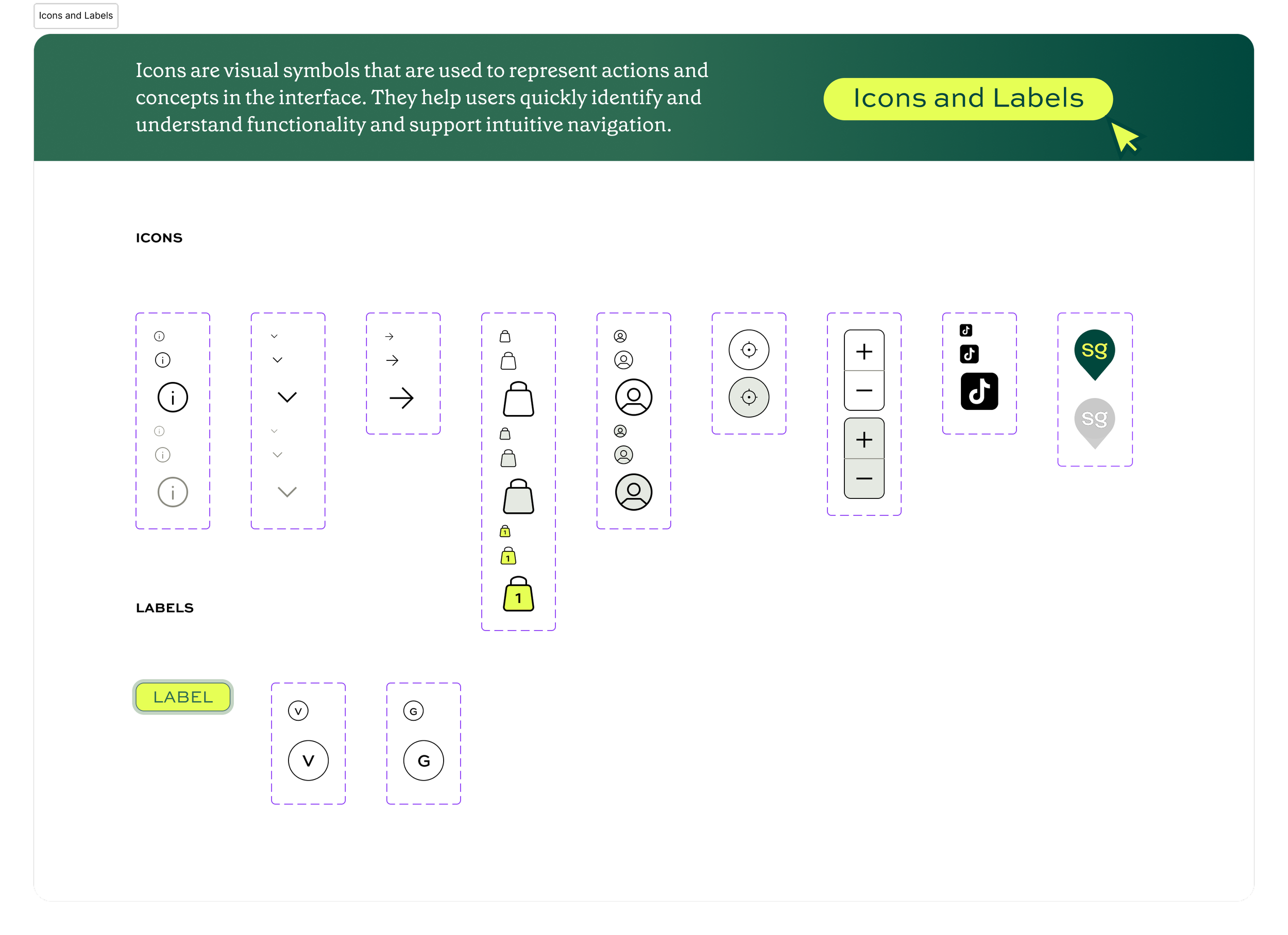
Iconography – Created a unified icon set with consistent style and sizing.
Logos – Defined logo usage, sizing, and placement rules to maintain brand integrity.
Media – Set guidelines for illustrations, photography, and other visual assets to maintain visual cohesion.
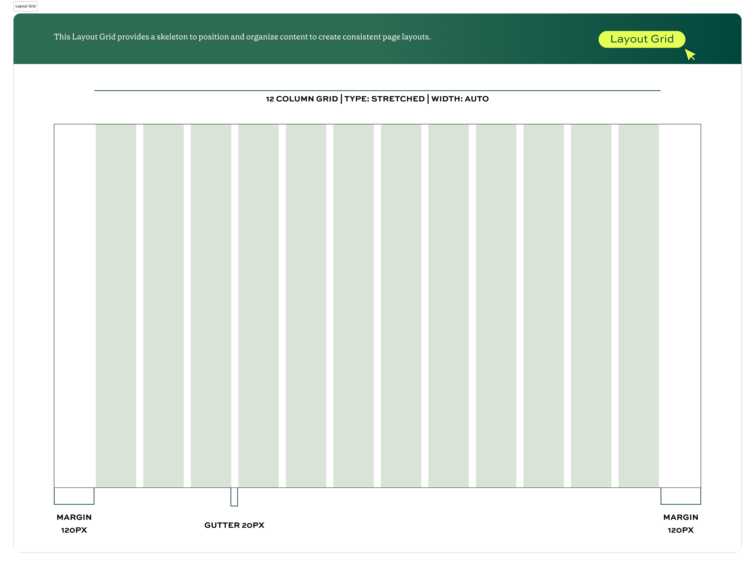
Layout grids and spacing – Defined a flexible grid system with spacing rules.
Backgrounds – Standardized background styles and usage for clarity and visual harmony.
This foundation created clarity and alignment across screens.
Next, we moved on to Design Tokens:
We translated these foundational decisions into design tokens and variables, allowing the system to scale while staying consistent.
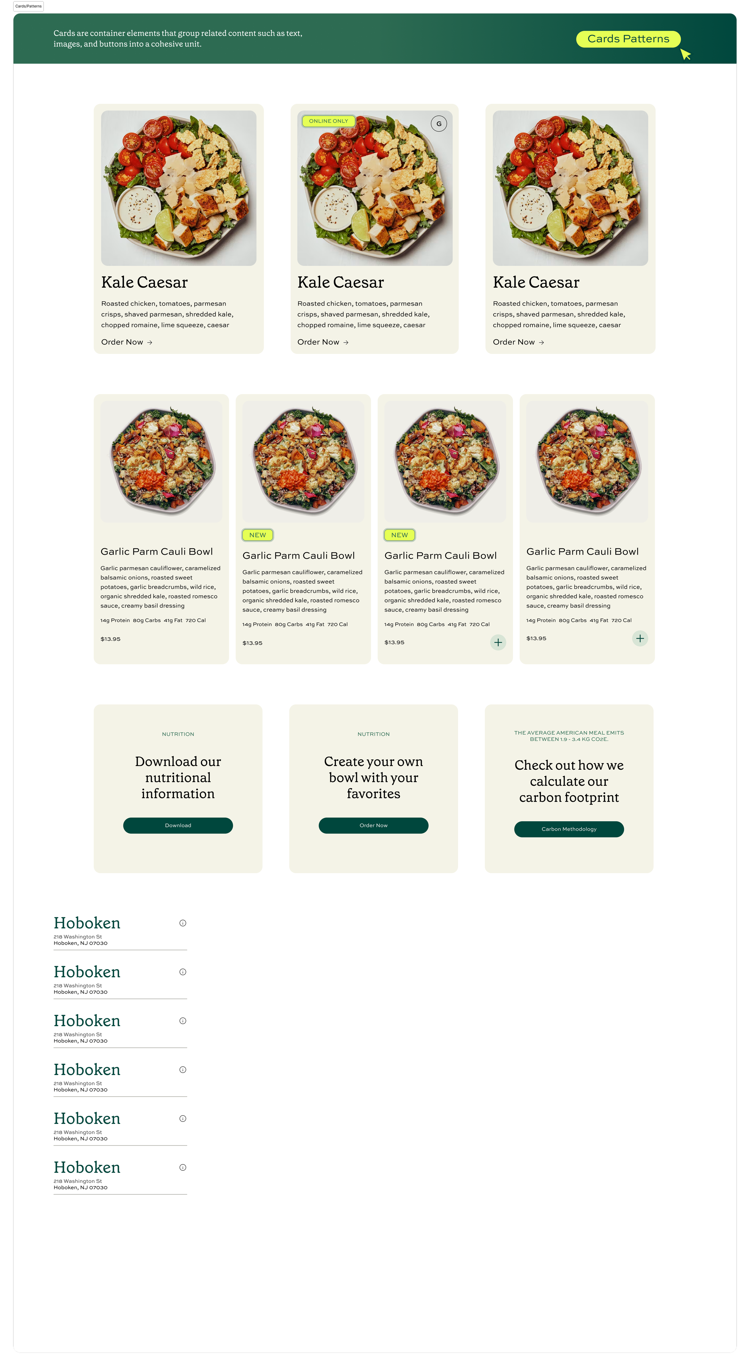
🥙Tossing the Bowl: Components & Patterns
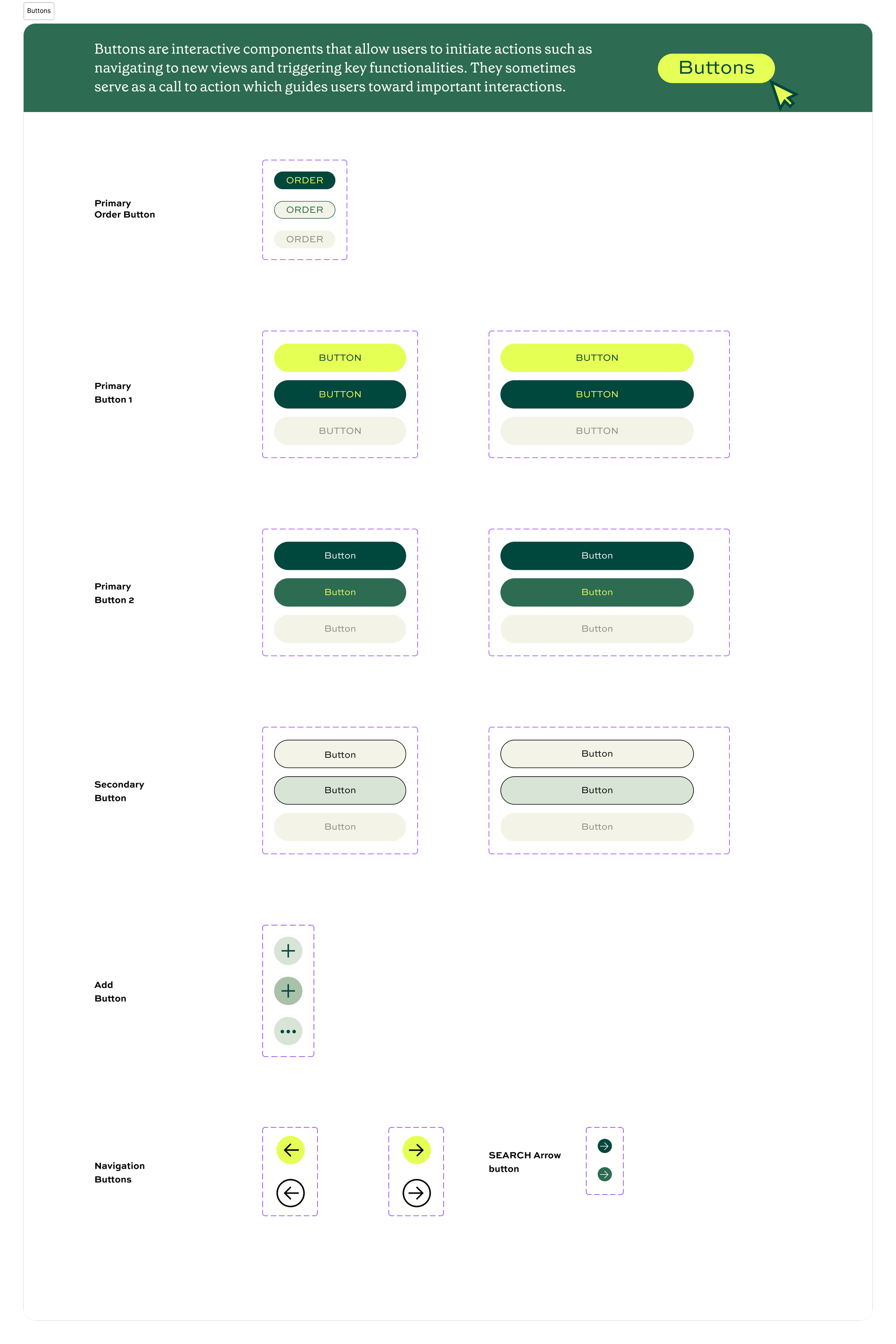
Using the foundations, we built a component library including:
Buttons
Cards
Dividers
Search Bar
Text links
Banners
Sidebar
Navigation and Tabs
Each component was designed for reuse, flexibility, and accessibility.
We reduced inconsistency and improved accessibility by redesigning components around shared standards.
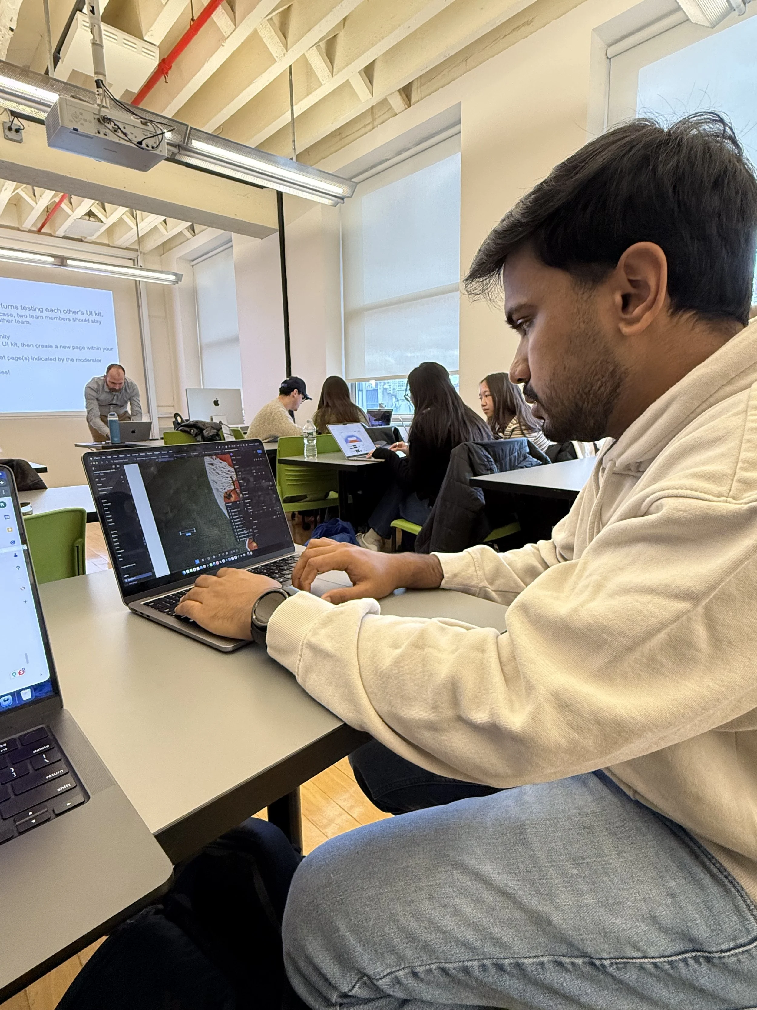
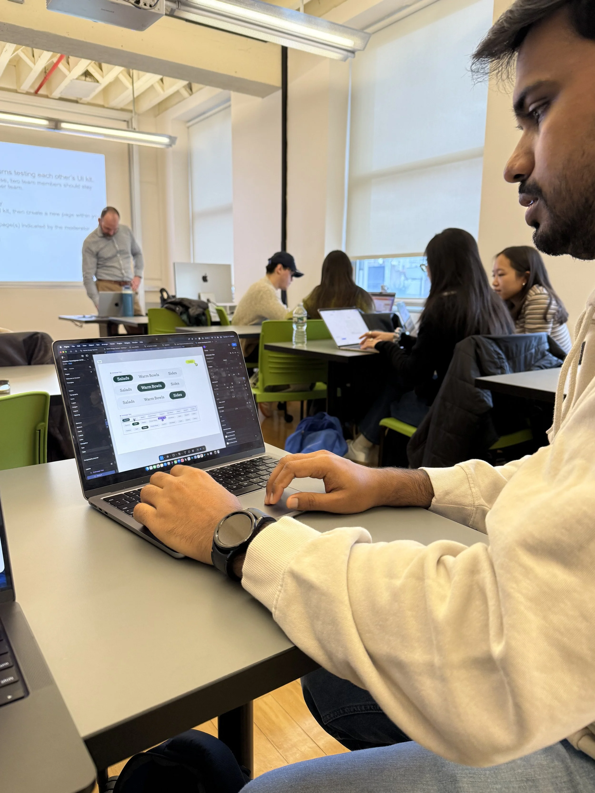
We ran a quick round of testing to see how the system held up.
What worked
Tokens and styles made design decisions more underatandable
Components and patterns increased efficiency
What we reworked
Naming conventions of Components on the Figma File
Information architecture of the Figma File
Feedback helped us refine clarity and usability across the Figma File.
📦 Plating It Up
Documentation & Handoff
We created a documentation site on Zeroheight to help new designers, developers, and any users of the design system get up to speed quickly.
The site includes:
Onboarding guides for designers and developers, with design principles and accessibility guidelines.
Foundations covering core visual styles (color, typography), brand elements (icons, logos), and structural components (layout, tokens).
Components covering an overview, usage guidelines with do’s and don’ts illustrated through text and visuals, and accessibility standards to ensure all users can interact comfortably.
It also provides a way for anyone to contribute, making the system scalable and collaborative.
🌱 Final Bite: What I Took Away
Building Crouton made me realize that design isn’t just about visuals…it’s about articulation, communication, and embracing an iterative process.
What resonated most was seeing how small, intentional system decisions can scale into meaningful impact.
I contributed to key decisions around standardization, accessibility, and information architecture for component structure- always advocating for clarity and human-centered design.
Next Steps:
Expanding the components library by designing additional components
Crafting the mobile experience
Conducting further accessibility audits
Feel Authentic & Human
Thoughtful and meaningful designs that connect people, food, and the community.

Design on Figma!

We solved navigation challenges by introducing a unified global navigation and footer.
To support long-term adoption, we:
Published the UI Kit on Figma Community
Created a documentation site on zeroheight with usage guidelines and governance
Pitched the system and gathered feedback
Defined a roadmap for future expansion

Documentation on Zeroheight!
Quote by Lauren LoPrete